Visual Identity for Children and Youth Olympics
Scope
Visual identity
Client
Children and Youth Olympics
Year
2026
Industry
Sport
CONTEXT
The Olympics are not just about medals; they are, first and foremost, about fair play, friendship, shared experiences, and the long-term, dedicated work behind every athletic performance. Sports unite people across regions, ages, and disciplines. Our task was to create a cohesive yet dynamic visual identity system for this annual youth event that celebrates these core values while adapting to its changing locations.
APPROACH
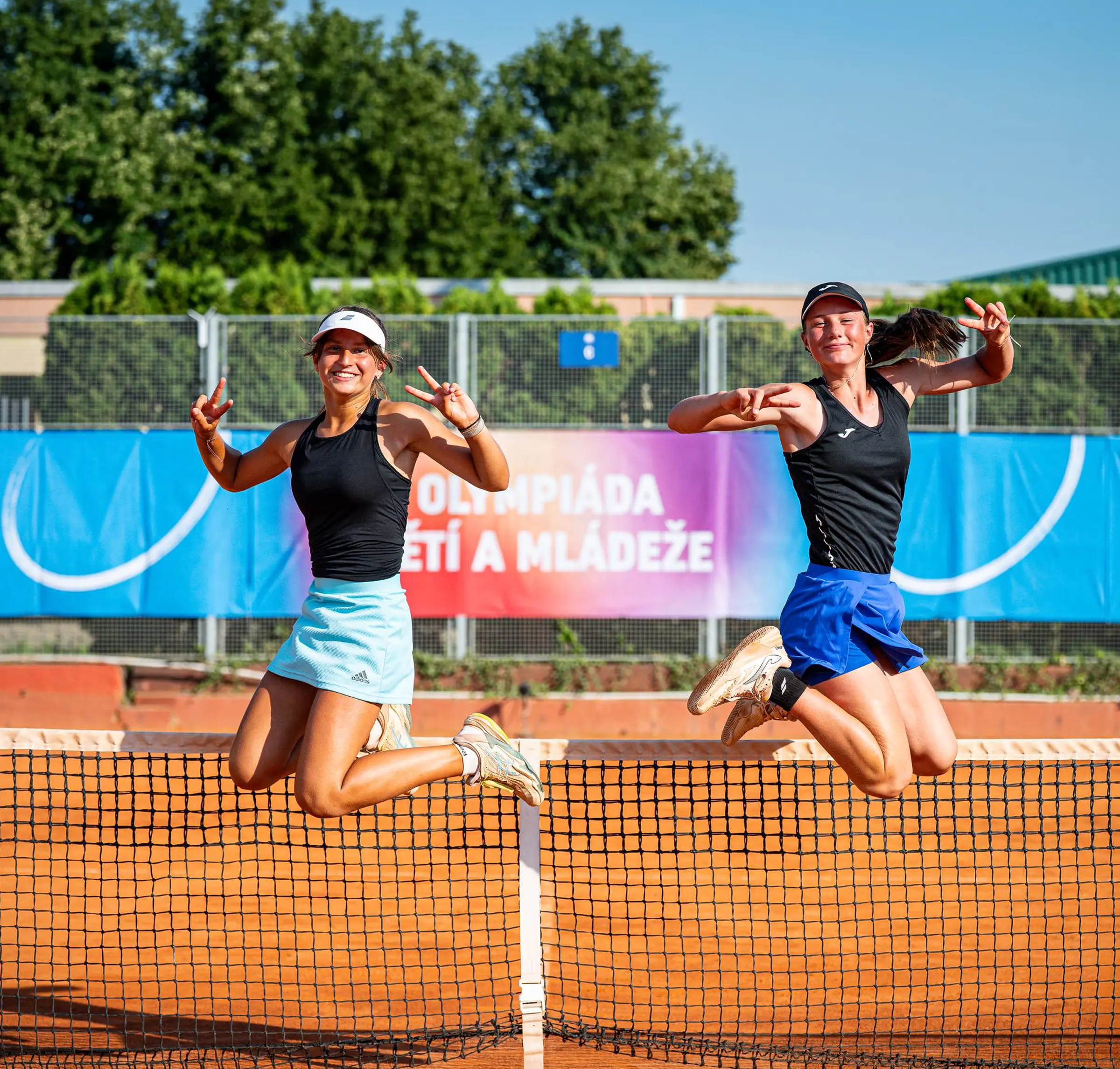
The identity design centers on the region as a fundamental element. As the host location changes each year, the unique characteristics of that region become a 'container' for all photographs and content. A pivotal role is played by authentic photography of the athletes, capturing true emotions—tension, effort, and joy.
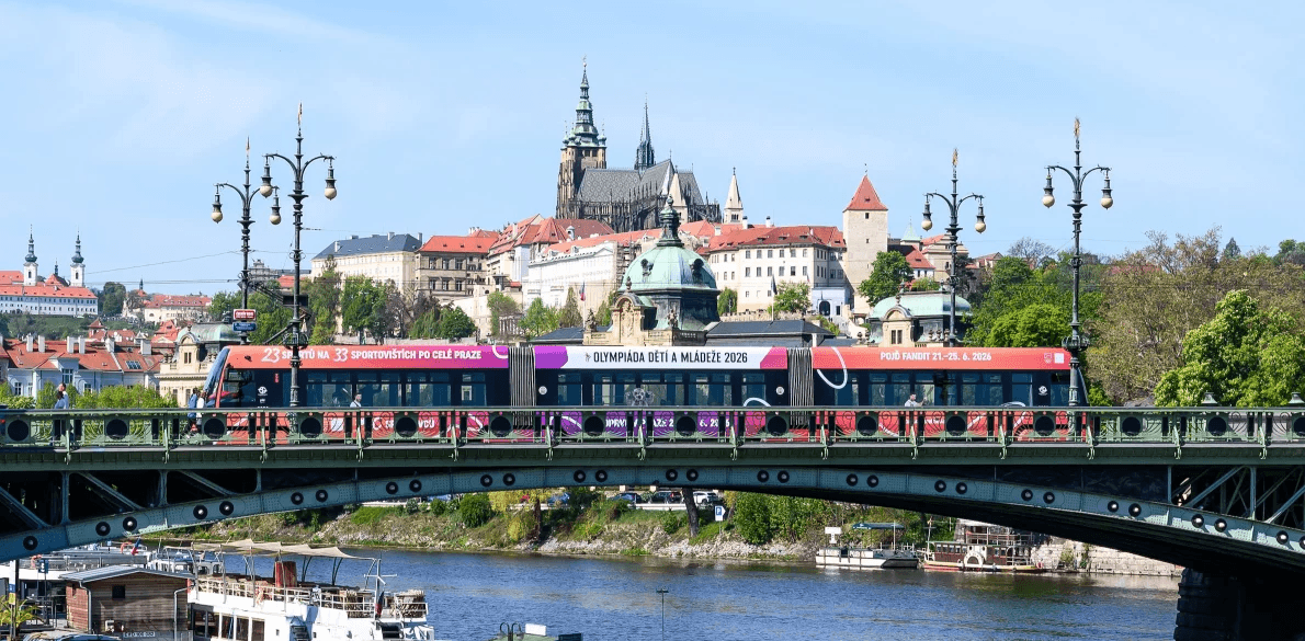
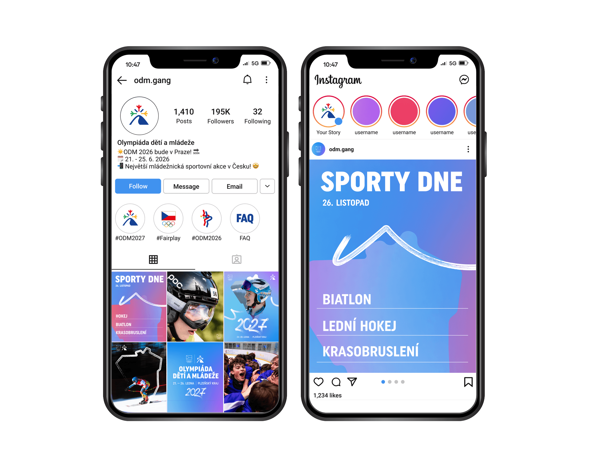
The visual language incorporates colorful gradients inspired by the digital world that today's generation has grown up in, with smartphones, tablets, and screens as a natural part of their daily reality. This digital nature is balanced by a 'human touch' element in the form of expressive brushstrokes, bringing humanity and dynamic energy directly into the identity system.
OUTCOME
The resulting identity is a resilient, adaptive, and long-term sustainable system. It allows for an annual overhaul—a different region, a different form, a different accent color—all while maintaining absolute consistency, recognition, and a strong visual character across successive years. The identity successfully connects the values of true sport with the digital expression of a new generation.
CREDITS
Visual Identity & Design System 21+21 studio (Sofiia Markova, Ondřej Skořepa & Daria Kriuchek)
CONTEXT
The Olympics are not just about medals; they are, first and foremost, about fair play, friendship, shared experiences, and the long-term, dedicated work behind every athletic performance. Sports unite people across regions, ages, and disciplines. Our task was to create a cohesive yet dynamic visual identity system for this annual youth event that celebrates these core values while adapting to its changing locations.
APPROACH
The identity design centers on the region as a fundamental element. As the host location changes each year, the unique characteristics of that region become a 'container' for all photographs and content. A pivotal role is played by authentic photography of the athletes, capturing true emotions—tension, effort, and joy.
The visual language incorporates colorful gradients inspired by the digital world that today's generation has grown up in, with smartphones, tablets, and screens as a natural part of their daily reality. This digital nature is balanced by a 'human touch' element in the form of expressive brushstrokes, bringing humanity and dynamic energy directly into the identity system.
OUTCOME
The resulting identity is a resilient, adaptive, and long-term sustainable system. It allows for an annual overhaul—a different region, a different form, a different accent color—all while maintaining absolute consistency, recognition, and a strong visual character across successive years. The identity successfully connects the values of true sport with the digital expression of a new generation.
CREDITS
Visual Identity & Design System 21+21 studio (Sofiia Markova, Ondřej Skořepa & Daria Kriuchek)




CONTEXT
The Olympics are not just about medals; they are, first and foremost, about fair play, friendship, shared experiences, and the long-term, dedicated work behind every athletic performance. Sports unite people across regions, ages, and disciplines. Our task was to create a cohesive yet dynamic visual identity system for this annual youth event that celebrates these core values while adapting to its changing locations.
APPROACH
The identity design centers on the region as a fundamental element. As the host location changes each year, the unique characteristics of that region become a 'container' for all photographs and content. A pivotal role is played by authentic photography of the athletes, capturing true emotions—tension, effort, and joy.
The visual language incorporates colorful gradients inspired by the digital world that today's generation has grown up in, with smartphones, tablets, and screens as a natural part of their daily reality. This digital nature is balanced by a 'human touch' element in the form of expressive brushstrokes, bringing humanity and dynamic energy directly into the identity system.
OUTCOME
The resulting identity is a resilient, adaptive, and long-term sustainable system. It allows for an annual overhaul—a different region, a different form, a different accent color—all while maintaining absolute consistency, recognition, and a strong visual character across successive years. The identity successfully connects the values of true sport with the digital expression of a new generation.
CREDITS
Visual Identity & Design System 21+21 studio (Sofiia Markova, Ondřej Skořepa & Daria Kriuchek)

Visual Identity for Children and Youth Olympics
Scope
Visual identity
Client
Children and Youth Olympics
Year
2026
Industry
Sport
CONTEXT
The Olympics are not just about medals; they are, first and foremost, about fair play, friendship, shared experiences, and the long-term, dedicated work behind every athletic performance. Sports unite people across regions, ages, and disciplines. Our task was to create a cohesive yet dynamic visual identity system for this annual youth event that celebrates these core values while adapting to its changing locations.
APPROACH
The identity design centers on the region as a fundamental element. As the host location changes each year, the unique characteristics of that region become a 'container' for all photographs and content. A pivotal role is played by authentic photography of the athletes, capturing true emotions—tension, effort, and joy.
The visual language incorporates colorful gradients inspired by the digital world that today's generation has grown up in, with smartphones, tablets, and screens as a natural part of their daily reality. This digital nature is balanced by a 'human touch' element in the form of expressive brushstrokes, bringing humanity and dynamic energy directly into the identity system.
OUTCOME
The resulting identity is a resilient, adaptive, and long-term sustainable system. It allows for an annual overhaul—a different region, a different form, a different accent color—all while maintaining absolute consistency, recognition, and a strong visual character across successive years. The identity successfully connects the values of true sport with the digital expression of a new generation.
CREDITS
Visual Identity & Design System 21+21 studio (Sofiia Markova, Ondřej Skořepa & Daria Kriuchek)
CONTEXT
The Olympics are not just about medals; they are, first and foremost, about fair play, friendship, shared experiences, and the long-term, dedicated work behind every athletic performance. Sports unite people across regions, ages, and disciplines. Our task was to create a cohesive yet dynamic visual identity system for this annual youth event that celebrates these core values while adapting to its changing locations.
APPROACH
The identity design centers on the region as a fundamental element. As the host location changes each year, the unique characteristics of that region become a 'container' for all photographs and content. A pivotal role is played by authentic photography of the athletes, capturing true emotions—tension, effort, and joy.
The visual language incorporates colorful gradients inspired by the digital world that today's generation has grown up in, with smartphones, tablets, and screens as a natural part of their daily reality. This digital nature is balanced by a 'human touch' element in the form of expressive brushstrokes, bringing humanity and dynamic energy directly into the identity system.
OUTCOME
The resulting identity is a resilient, adaptive, and long-term sustainable system. It allows for an annual overhaul—a different region, a different form, a different accent color—all while maintaining absolute consistency, recognition, and a strong visual character across successive years. The identity successfully connects the values of true sport with the digital expression of a new generation.
CREDITS
Visual Identity & Design System 21+21 studio (Sofiia Markova, Ondřej Skořepa & Daria Kriuchek)
CONTEXT
The Olympics are not just about medals; they are, first and foremost, about fair play, friendship, shared experiences, and the long-term, dedicated work behind every athletic performance. Sports unite people across regions, ages, and disciplines. Our task was to create a cohesive yet dynamic visual identity system for this annual youth event that celebrates these core values while adapting to its changing locations.
APPROACH
The identity design centers on the region as a fundamental element. As the host location changes each year, the unique characteristics of that region become a 'container' for all photographs and content. A pivotal role is played by authentic photography of the athletes, capturing true emotions—tension, effort, and joy.
The visual language incorporates colorful gradients inspired by the digital world that today's generation has grown up in, with smartphones, tablets, and screens as a natural part of their daily reality. This digital nature is balanced by a 'human touch' element in the form of expressive brushstrokes, bringing humanity and dynamic energy directly into the identity system.
OUTCOME
The resulting identity is a resilient, adaptive, and long-term sustainable system. It allows for an annual overhaul—a different region, a different form, a different accent color—all while maintaining absolute consistency, recognition, and a strong visual character across successive years. The identity successfully connects the values of true sport with the digital expression of a new generation.
CREDITS
Visual Identity & Design System 21+21 studio (Sofiia Markova, Ondřej Skořepa & Daria Kriuchek)
Visual Identity for Children and Youth Olympics
Scope
Visual identity
Client
Children and Youth Olympics
Year
2026
Industry
Sport
CONTEXT
The Olympics are not just about medals; they are, first and foremost, about fair play, friendship, shared experiences, and the long-term, dedicated work behind every athletic performance. Sports unite people across regions, ages, and disciplines. Our task was to create a cohesive yet dynamic visual identity system for this annual youth event that celebrates these core values while adapting to its changing locations.
APPROACH
The identity design centers on the region as a fundamental element. As the host location changes each year, the unique characteristics of that region become a 'container' for all photographs and content. A pivotal role is played by authentic photography of the athletes, capturing true emotions—tension, effort, and joy.
The visual language incorporates colorful gradients inspired by the digital world that today's generation has grown up in, with smartphones, tablets, and screens as a natural part of their daily reality. This digital nature is balanced by a 'human touch' element in the form of expressive brushstrokes, bringing humanity and dynamic energy directly into the identity system.
OUTCOME
The resulting identity is a resilient, adaptive, and long-term sustainable system. It allows for an annual overhaul—a different region, a different form, a different accent color—all while maintaining absolute consistency, recognition, and a strong visual character across successive years. The identity successfully connects the values of true sport with the digital expression of a new generation.
CREDITS
Visual Identity & Design System 21+21 studio (Sofiia Markova, Ondřej Skořepa & Daria Kriuchek)
CONTEXT
The Olympics are not just about medals; they are, first and foremost, about fair play, friendship, shared experiences, and the long-term, dedicated work behind every athletic performance. Sports unite people across regions, ages, and disciplines. Our task was to create a cohesive yet dynamic visual identity system for this annual youth event that celebrates these core values while adapting to its changing locations.
APPROACH
The identity design centers on the region as a fundamental element. As the host location changes each year, the unique characteristics of that region become a 'container' for all photographs and content. A pivotal role is played by authentic photography of the athletes, capturing true emotions—tension, effort, and joy.
The visual language incorporates colorful gradients inspired by the digital world that today's generation has grown up in, with smartphones, tablets, and screens as a natural part of their daily reality. This digital nature is balanced by a 'human touch' element in the form of expressive brushstrokes, bringing humanity and dynamic energy directly into the identity system.
OUTCOME
The resulting identity is a resilient, adaptive, and long-term sustainable system. It allows for an annual overhaul—a different region, a different form, a different accent color—all while maintaining absolute consistency, recognition, and a strong visual character across successive years. The identity successfully connects the values of true sport with the digital expression of a new generation.
CREDITS
Visual Identity & Design System 21+21 studio (Sofiia Markova, Ondřej Skořepa & Daria Kriuchek)
CONTEXT
The Olympics are not just about medals; they are, first and foremost, about fair play, friendship, shared experiences, and the long-term, dedicated work behind every athletic performance. Sports unite people across regions, ages, and disciplines. Our task was to create a cohesive yet dynamic visual identity system for this annual youth event that celebrates these core values while adapting to its changing locations.
APPROACH
The identity design centers on the region as a fundamental element. As the host location changes each year, the unique characteristics of that region become a 'container' for all photographs and content. A pivotal role is played by authentic photography of the athletes, capturing true emotions—tension, effort, and joy.
The visual language incorporates colorful gradients inspired by the digital world that today's generation has grown up in, with smartphones, tablets, and screens as a natural part of their daily reality. This digital nature is balanced by a 'human touch' element in the form of expressive brushstrokes, bringing humanity and dynamic energy directly into the identity system.
OUTCOME
The resulting identity is a resilient, adaptive, and long-term sustainable system. It allows for an annual overhaul—a different region, a different form, a different accent color—all while maintaining absolute consistency, recognition, and a strong visual character across successive years. The identity successfully connects the values of true sport with the digital expression of a new generation.
CREDITS
Visual Identity & Design System 21+21 studio (Sofiia Markova, Ondřej Skořepa & Daria Kriuchek)