Northlane Studio
Scope
Visual Identity
Client
MUD
Year
[2025]
Industry
Art
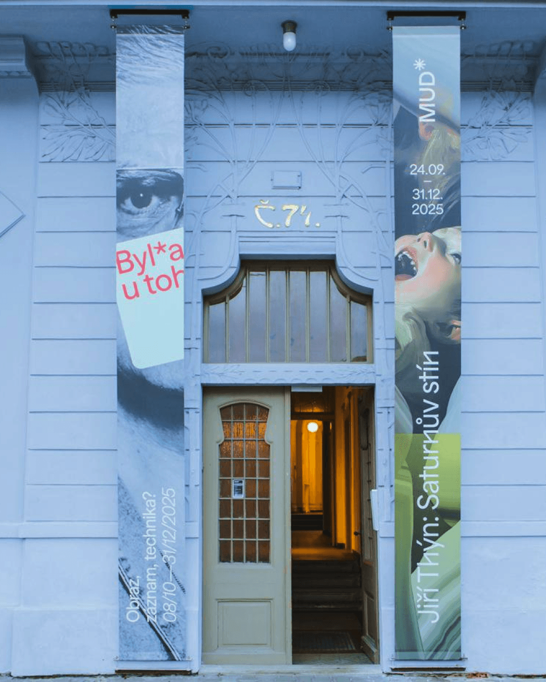
Northlane Studio is a multidisciplinary creative practice working across design, strategy, and culture. The goal of this project was to establish a visual identity and digital presence that felt calm, confident, and deliberately understated.
Rather than competing for attention, the work focused on clarity — allowing the studio’s projects and thinking to remain at the center.
Context
Northlane approached the project at a moment of transition. Their work had matured, but their visual language no longer reflected the quality or depth of what they were producing.
The challenge was to create an identity system that could support a wide range of outputs — from client work to editorial content — without feeling rigid or over-designed.
Approach
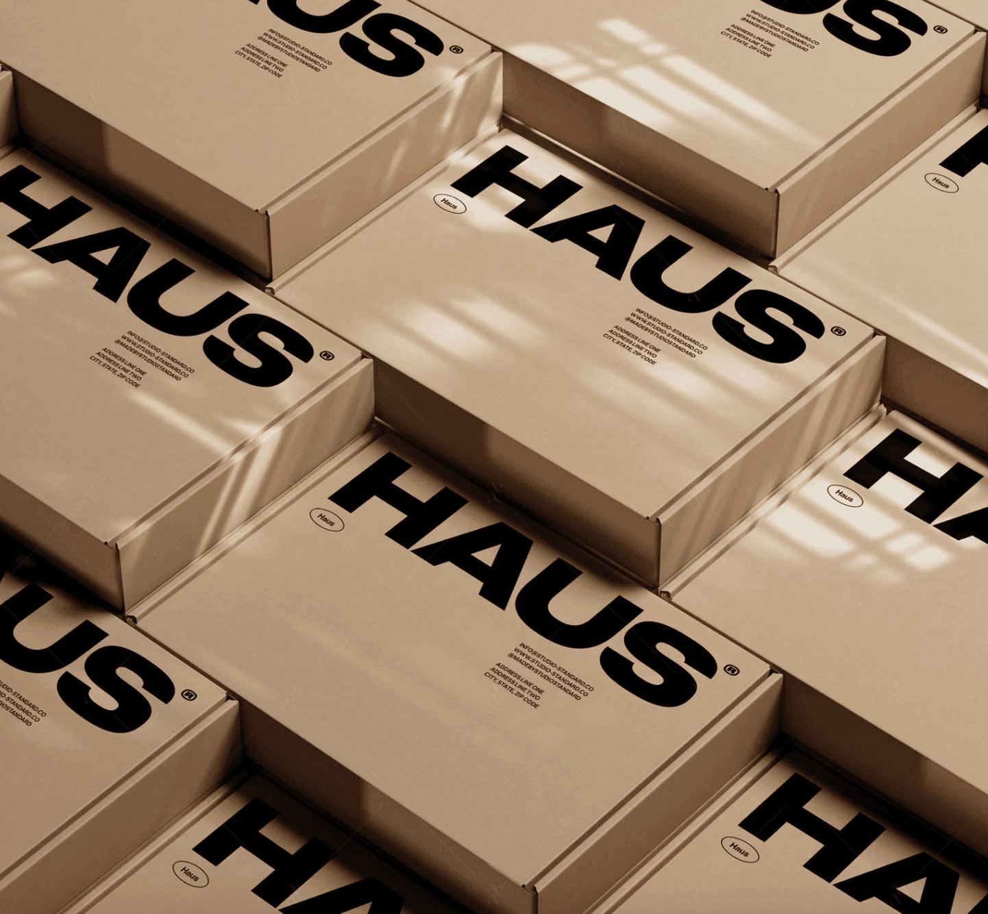
The identity was built around a restrained typographic system and a neutral, flexible palette. Spacing, rhythm, and hierarchy were treated as core design elements rather than decorative choices.
For the website, the focus was on simplicity and flow. Large visual moments are balanced by quiet text blocks, creating a reading experience that feels natural and unforced.
Every decision aimed to reduce noise and increase legibility — visually and conceptually.
Outcome
The result is a brand and digital presence that feels composed and intentional. The system adapts easily across formats while maintaining a clear point of view.
Northlane now has a platform that reflects how they work: thoughtful, precise, and confident without excess.
Credits
Creative Direction & Design
Lucas Bennett





Northlane Studio
Scope
Visual Identity
Client
MUD
Year
[2025]
Industry
Art
Northlane Studio is a multidisciplinary creative practice working across design, strategy, and culture. The goal of this project was to establish a visual identity and digital presence that felt calm, confident, and deliberately understated.
Rather than competing for attention, the work focused on clarity — allowing the studio’s projects and thinking to remain at the center.
Context
Northlane approached the project at a moment of transition. Their work had matured, but their visual language no longer reflected the quality or depth of what they were producing.
The challenge was to create an identity system that could support a wide range of outputs — from client work to editorial content — without feeling rigid or over-designed.
Approach
The identity was built around a restrained typographic system and a neutral, flexible palette. Spacing, rhythm, and hierarchy were treated as core design elements rather than decorative choices.
For the website, the focus was on simplicity and flow. Large visual moments are balanced by quiet text blocks, creating a reading experience that feels natural and unforced.
Every decision aimed to reduce noise and increase legibility — visually and conceptually.
Outcome
The result is a brand and digital presence that feels composed and intentional. The system adapts easily across formats while maintaining a clear point of view.
Northlane now has a platform that reflects how they work: thoughtful, precise, and confident without excess.
Credits
Creative Direction & Design
Lucas Bennett
Northlane Studio
Scope
Visual Identity
Client
MUD
Year
[2025]
Industry
Art
Northlane Studio is a multidisciplinary creative practice working across design, strategy, and culture. The goal of this project was to establish a visual identity and digital presence that felt calm, confident, and deliberately understated.
Rather than competing for attention, the work focused on clarity — allowing the studio’s projects and thinking to remain at the center.
Context
Northlane approached the project at a moment of transition. Their work had matured, but their visual language no longer reflected the quality or depth of what they were producing.
The challenge was to create an identity system that could support a wide range of outputs — from client work to editorial content — without feeling rigid or over-designed.
Approach
The identity was built around a restrained typographic system and a neutral, flexible palette. Spacing, rhythm, and hierarchy were treated as core design elements rather than decorative choices.
For the website, the focus was on simplicity and flow. Large visual moments are balanced by quiet text blocks, creating a reading experience that feels natural and unforced.
Every decision aimed to reduce noise and increase legibility — visually and conceptually.
Outcome
The result is a brand and digital presence that feels composed and intentional. The system adapts easily across formats while maintaining a clear point of view.
Northlane now has a platform that reflects how they work: thoughtful, precise, and confident without excess.
Credits
Creative Direction & Design
Lucas Bennett